
" A minimal botanical identity shaped by quiet beauty and everyday rituals."
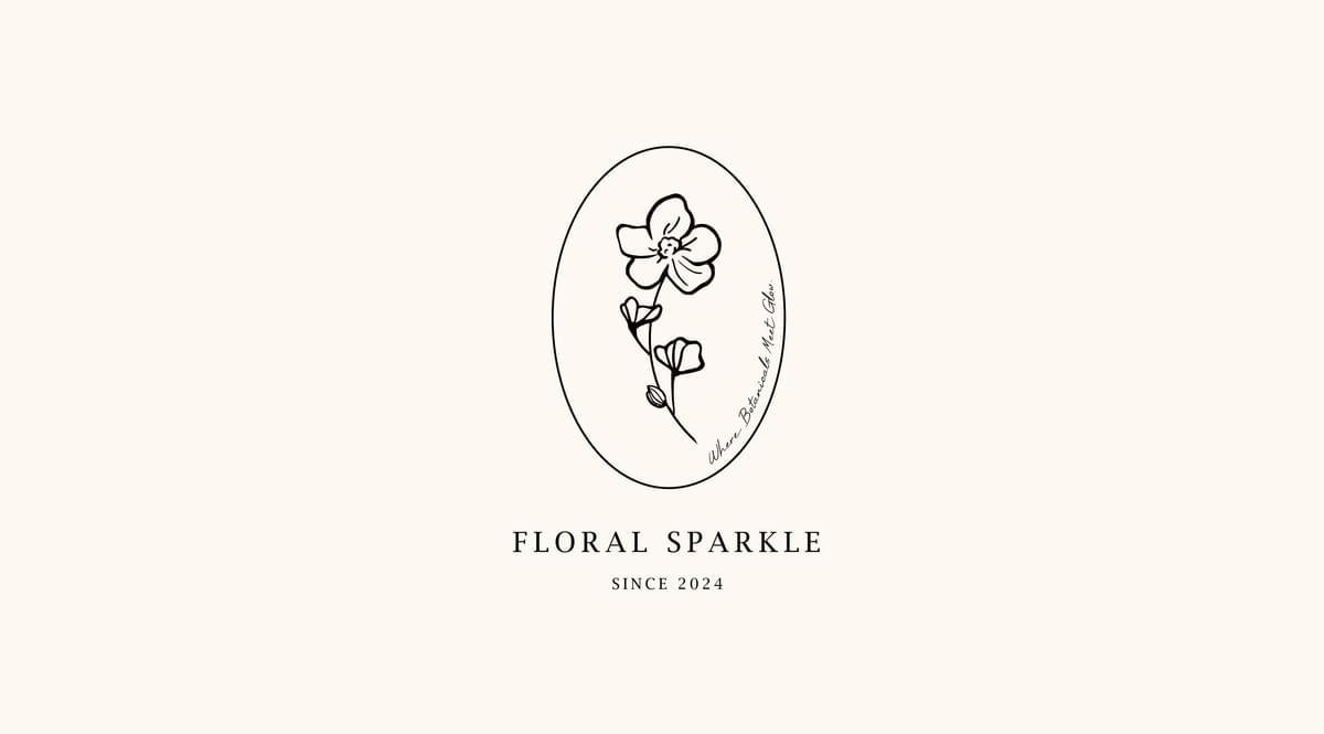
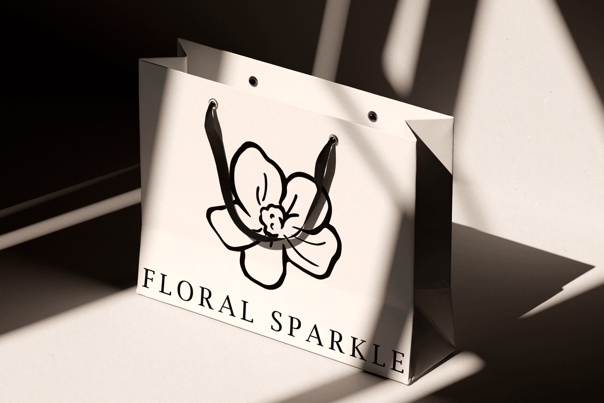
A hand-drawn floral mark serves as the core visual element of the brand, paired with an oval frame to create a natural, delicate, and recognizable identity.
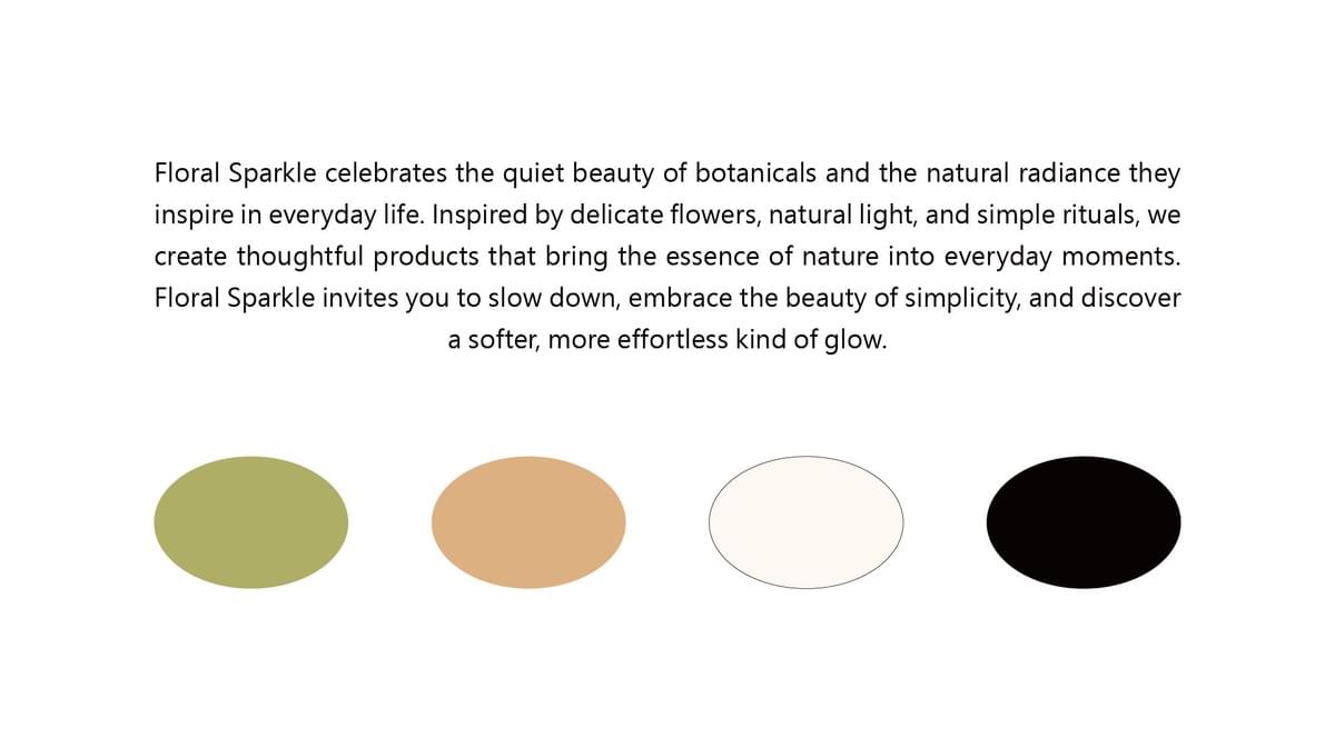

Inspired by the colors of nature, olive green, beige, and soft neutrals form a muted palette that creates a calm and understated visual character.

The transparent bottle and olive green cap give the packaging a light, understated presence, while white typography enhances its clarity.

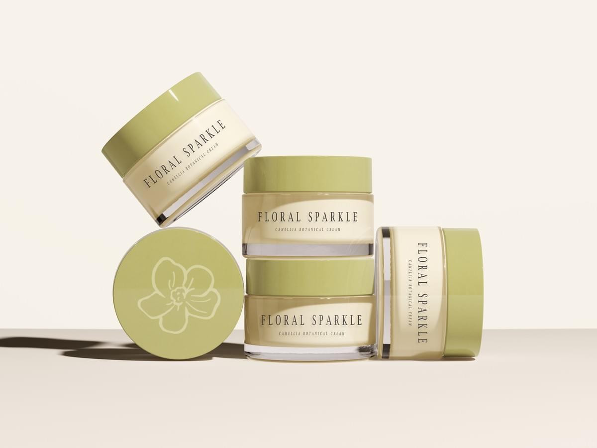
The cream features a beige bottle with black typography and the signature olive green cap, creating a distinct color balance while maintaining a cohesive look across the Camellia series.
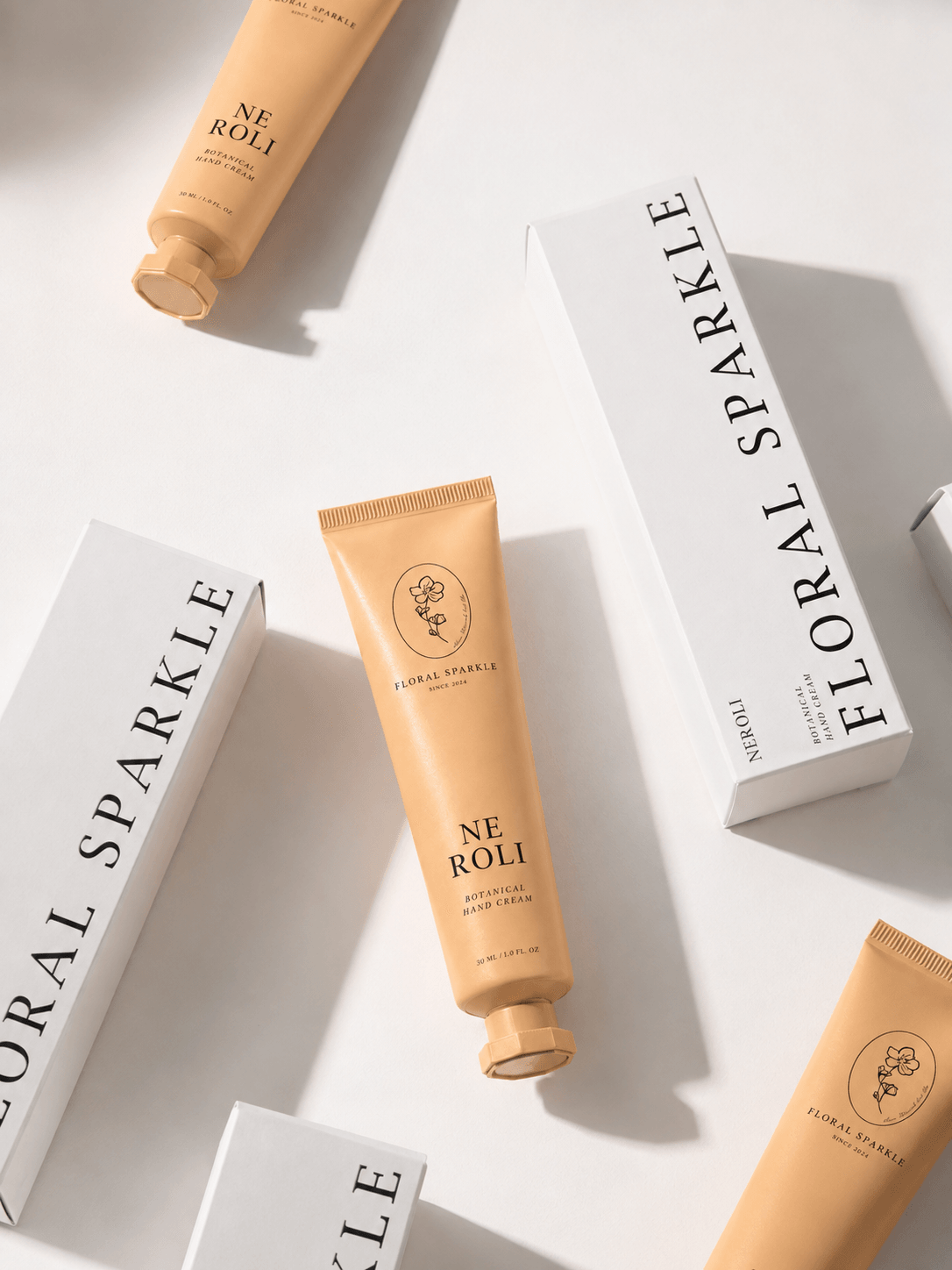
The Neroli Hand Cream features a soft milk-tea orange, while the outer packaging adopts a black-and-white palette, creating a contrast between the gentle product tone and the understated presentation.